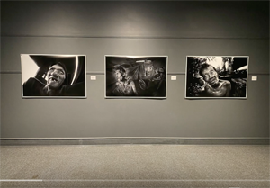
Today I received magazine #2 a 20 page series of scans of marked contact sheets I quite like. On a scale of 1 to 10 this would get around a 8. The cover is a tad dark but the rest of the contact pages work nicely. This thing feels so good I am thinking of expanding this version for the exhibition or making an entirely new third magazine of other contacts (probably the best way to go). With contacts if they are to contrasty or to dark or light thats OK, it adds to the arty farty feel of the whole thing. It helps create the illusion I am an artiste!!
The big difference this time around is the quality of the paper. When I originally read about it the paper was described as having a matt finish, a surface I am not that fond of in the darkroom printing photo paper world. In blurb magazine world this matt paper kicks ass over the cheaper ($1 per mag) glossy stuff.
This is going to work for the show. I will have to make some minor changes and then will probably print out 3 versions of magazines on the matt paper for the big event. These things will not be in the class as the catalogs Larry will have printed but they are affordable for me and still half decent looking, I do not need to be embarrassed by their quality.
My plan is to:
1) redo of the original photo edition, lightning several photos, adjusting contrast down, have 2 mags printed.
2) second printing of this contact sheet version with slight changes to lighten the cover, have 2 mags printed.
3) make an entirely brand new 3rd magazine of contact sheets. 2 mags printed for the show. This would take quite a bit of additional time to create. I will have to find more 11x14 contacts worth scanning or print more on RC paper.
I am not sure I need 2 copies of each but if by some semi miracle a mag sells ($15) it would be good thing to have a second copy available for viewing. Printing everything should cost around $65 or $80 USD, a good cheap price.
Another rather strange thing is the blacks are good (a true black) on the cover and on the interior pages on this latest version. Last time round the cover had a bluish tinge to it. I wonder if this difference is because the first time I went with the Canadian version of Blurb (blurb.ca) and the second time opted for the American (blurb.com)?
Here is a short video of me flipping through the new mag:
https://vimeo.com/111920551
The big difference this time around is the quality of the paper. When I originally read about it the paper was described as having a matt finish, a surface I am not that fond of in the darkroom printing photo paper world. In blurb magazine world this matt paper kicks ass over the cheaper ($1 per mag) glossy stuff.
This is going to work for the show. I will have to make some minor changes and then will probably print out 3 versions of magazines on the matt paper for the big event. These things will not be in the class as the catalogs Larry will have printed but they are affordable for me and still half decent looking, I do not need to be embarrassed by their quality.
My plan is to:
1) redo of the original photo edition, lightning several photos, adjusting contrast down, have 2 mags printed.
2) second printing of this contact sheet version with slight changes to lighten the cover, have 2 mags printed.
3) make an entirely brand new 3rd magazine of contact sheets. 2 mags printed for the show. This would take quite a bit of additional time to create. I will have to find more 11x14 contacts worth scanning or print more on RC paper.
I am not sure I need 2 copies of each but if by some semi miracle a mag sells ($15) it would be good thing to have a second copy available for viewing. Printing everything should cost around $65 or $80 USD, a good cheap price.
Another rather strange thing is the blacks are good (a true black) on the cover and on the interior pages on this latest version. Last time round the cover had a bluish tinge to it. I wonder if this difference is because the first time I went with the Canadian version of Blurb (blurb.ca) and the second time opted for the American (blurb.com)?
Here is a short video of me flipping through the new mag:
Here is a higher quality Vimeo.com version link:
https://vimeo.com/111920551